This project involved designing a mobile podcast application tailored for listeners seeking high-quality educational and leadership content. The goal was to build a UI that encourages content discovery while providing a distraction-free, intuitive interface for audio consumption. By focusing on professional categories like Leadership, Business, and Personal Development, the design targets professionals and students who prioritize lifelong learning.
The Challenge (The Problem) Many audio platforms overwhelm users with too many choices on a single screen, making it difficult to find relevant content quickly. Additionally, playback interfaces are often cluttered, making simple actions like skipping forward or finding “what’s next” a point of friction for users who are often multitasking.
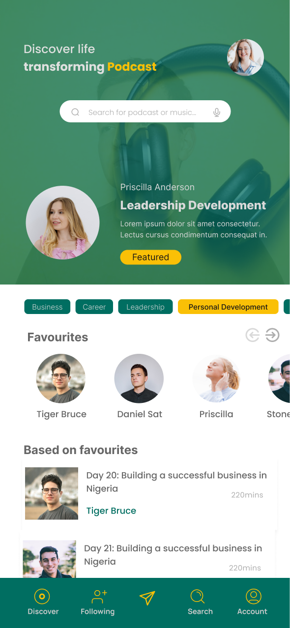
The Strategic Approach (The Solution)
Intuitive Discovery Feed: I designed a home screen that uses categorized pills (e.g., “Leadership,” “Business”) to allow for instant filtering. A “Featured” hero section uses high-quality imagery to highlight top-tier creators like Priscilla Anderson, reducing the time it takes to find quality content.
Visual Personalization: The “Favourites” carousel and “Based on Favourites” section provide a personalized UX, ensuring the app feels tailored to the individual’s specific interests in professional growth.
Minimalist Playback UI: The “Playing” screen was designed with a focus on core controls. I used a large, centered play button and clear “10-second” skip icons to ensure ease of use even when the user is not fully focused on the screen.
Clear Content Hierarchy: In the “Playlist” and creator views, I utilized a clean typographic scale to separate the episode title from the summary and metadata (subscribers, podcasts count). This ensures that key information is scannable at a glance.
Integrated Professional Identity: Given your background in leadership from a biblical perspective, the design emphasizes clean, professional aesthetics that align with high-value educational content.
The design utilizes a deep forest green and vibrant gold color palette to establish a sense of growth, authority, and premium quality. I prioritized a bottom navigation bar for better reachability, allowing users to switch between “Discover,” “Following,” and “Search” with one hand. The interface uses rounded corners and soft shadows to create a modern, approachable feel that fits perfectly into a contemporary mobile ecosystem.